
google hat Gmail A few days ago, a new design was donated under Android, which brought the first components from Material You to the app. But there will soon be a major web redesign that could turn GMail into something it’s wanted for many years: a communication platform with integrated messaging products. The first screenshots show where the flight is headed.
It’s hard to believe, but GMail already celebrated its 17th birthday this year and it could soon change as much as never before in the platform’s long history. In a unified interface, GMail is set to become part of a larger communications platform, which will also receive Google Chat and Google Meet as well as spaces and some kind of contact management.
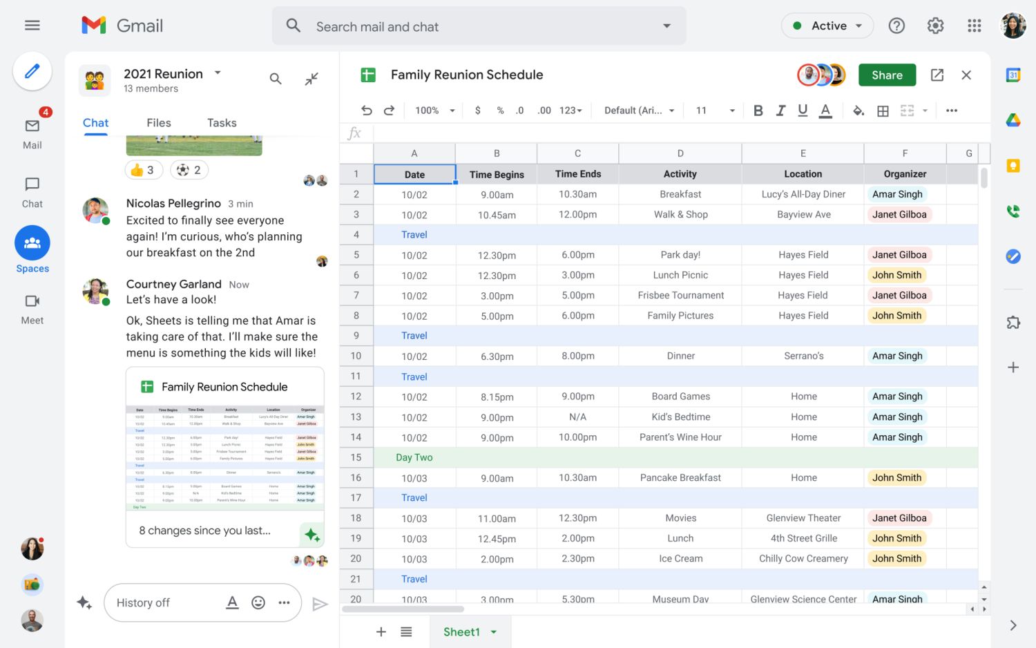
This change was announced last year with the opening of Google Chat and Google Meet to private users as well as linking Android apps shortly thereafter. Although many users hide the bar at the bottom again, at least one can guess from the many reactions, this bar will be brought to the browser soon. This bar has been around for a long time on Google Photos, but it works there for internal navigation, while in the new connectivity system it is used to switch between individual apps.
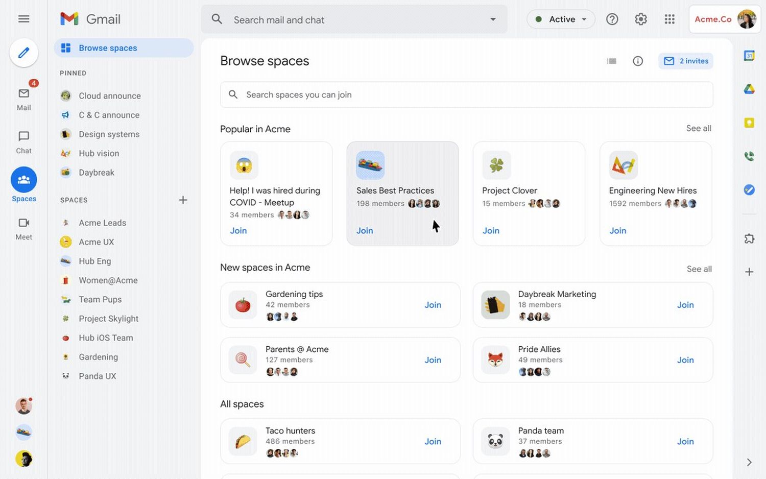
The first big step was taken a few months ago when GMail was renamed Google Workspace – at least on the splash screen when the app was launched. The following screenshots explain why the renaming is happening and how it will soon affect the interface.
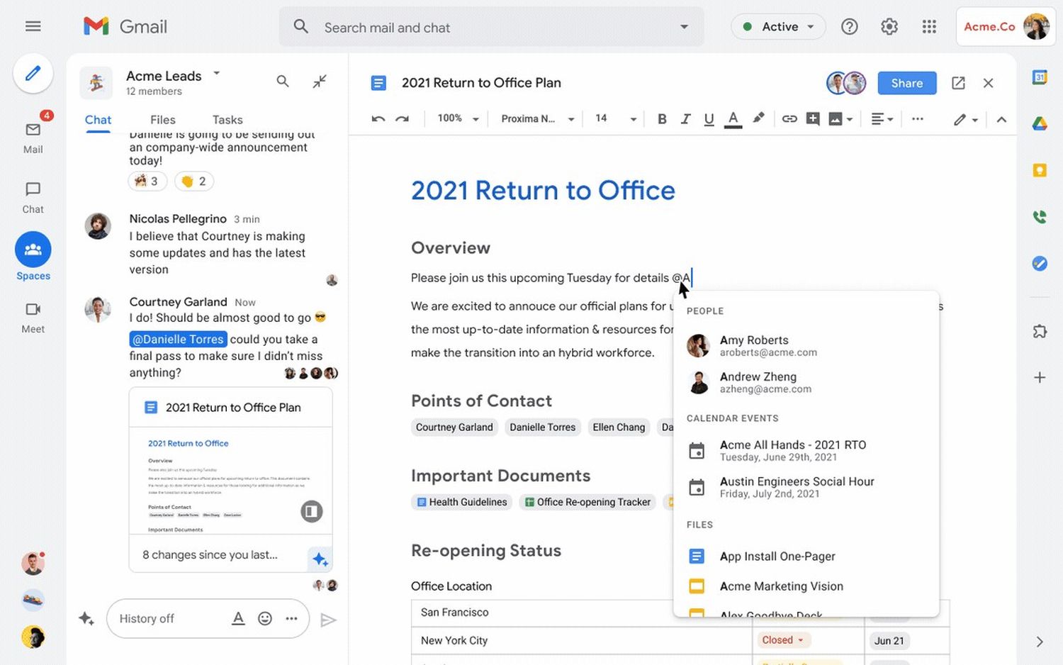
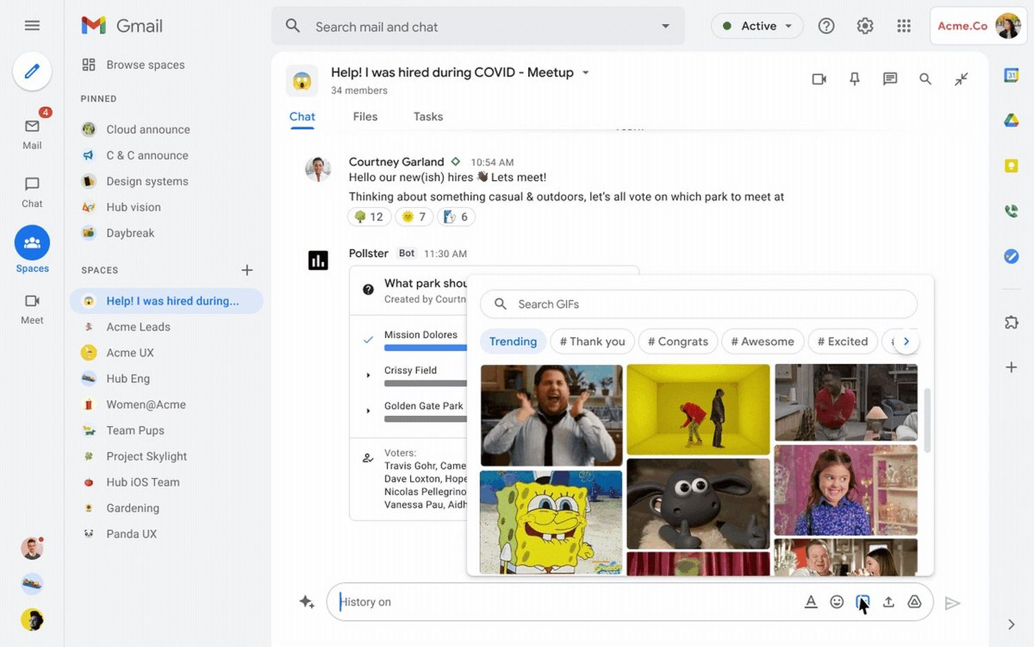
At first glance, it doesn’t really seem obvious, but this is also due to the fact that you have chosen the Spaces area for screenshots, which presents its own submenus and then also shows other content. Unfortunately, there are no screenshots of the real GMail interface, but the structure in the screenshots indicates that not much will change. The biggest innovation is the external framework with navigation between individual communication applications.
Under this external navigation on the left are the last contacted people, who can be reached very quickly via this. Other elements such as the search bar or the button for creating new content have also moved to this point and make room within individual apps in the slightly minimized area. In the right area of the gray outer ring is a toggle for other apps and sidebars, as you already know from the GMail and Docs & Co. user interface.
This new deck was announced in June, and is due to roll out “later in the summer.” That time would have come soon, so we can assume we’ll see the new interface this month. The big question would be: Can this be stopped again?
» Google Chat and Google Calendar: Messenger now suggests contacts based on the workspace calendar
» Google Contacts: This is how contacts can be archived (instead of deleting) – for a better overview in the phone book
Google Drive: New Offline mode is released – all types of files can be used offline
Subscribe to the GoogleWatchBlog newsletter

“Problem solver. Proud twitter specialist. Travel aficionado. Introvert. Coffee trailblazer. Professional zombie ninja. Extreme gamer.”



More Stories
With a surprise in the case: a strange cell phone from Nokia was introduced
PlayStation Stars: what it is, how it works and what it offers to its users | Sony | video games | tdex | revtli | the answers
t3n – Digital Pioneers | digital business magazine